
Under new leadership, Eastman Kodak Company was determined to invest in the product values that established it as one of the 20th century’s most culture-defining companies. Central to this mission was a brand reset that would be as confident as the tools it was creating.
We developed a coherent and comprehensive logo and brand architecture system with the aim of an organic roll-out, using available resources, with integrity and minimal interruption. This strategy required grace and careful planning with the company’s internal team.
From the brand positioning principles to packaging guidelines, our solution honored the company’s legacy of optimism and scientific heritage while also navigating a move toward the future with purposeful branding and a new business perspective.
STRATEGY
LOGO
BRAND SYSTEM
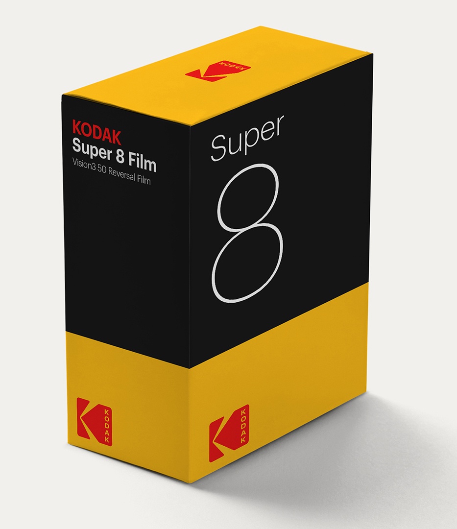
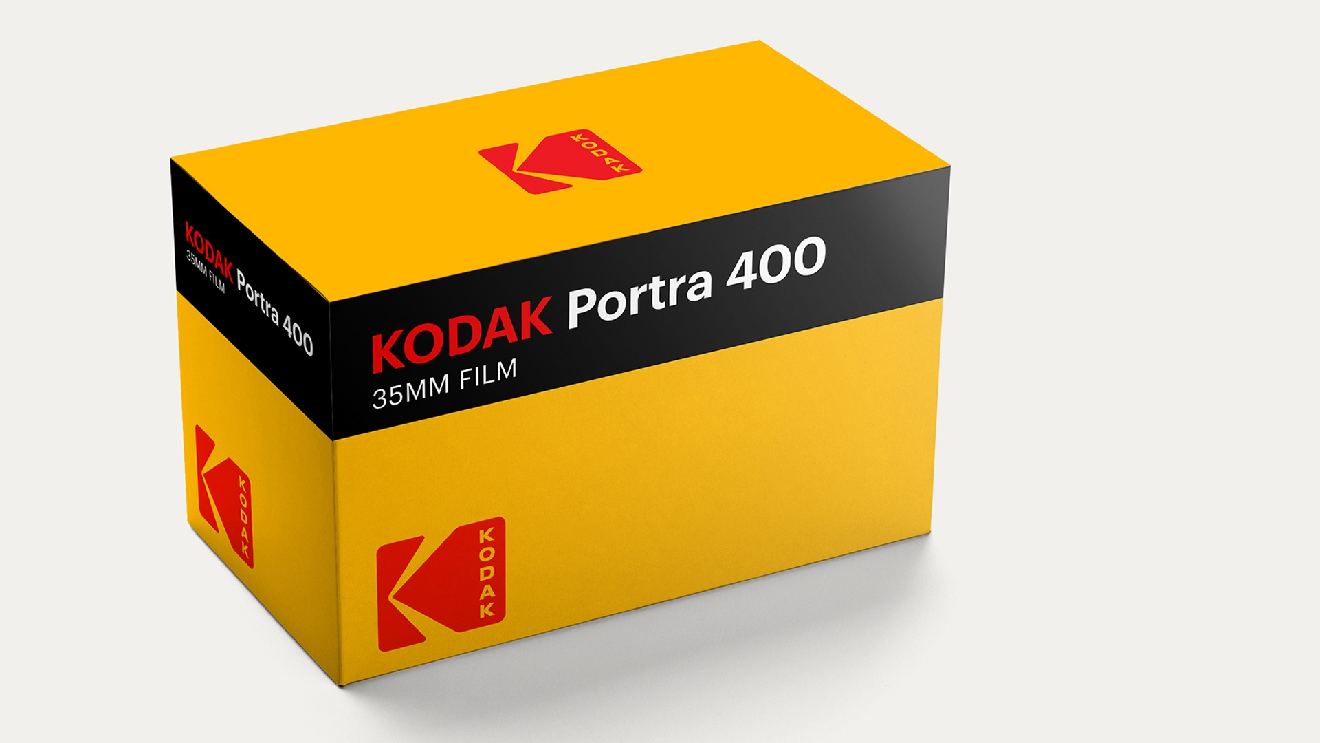
PACKAGING
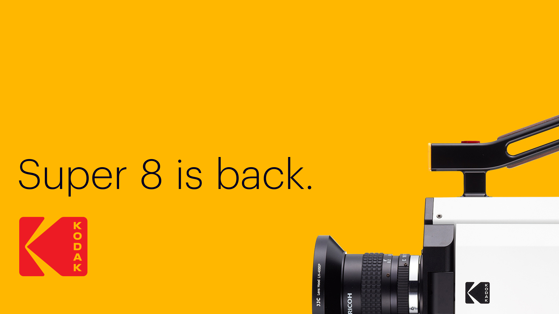
CAMPAIGN
TOOLKIT & GUIDELINES
ROLL-OUT STRATEGY
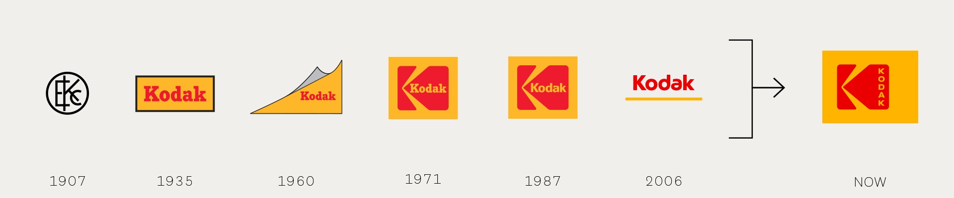
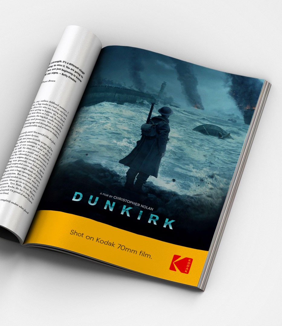
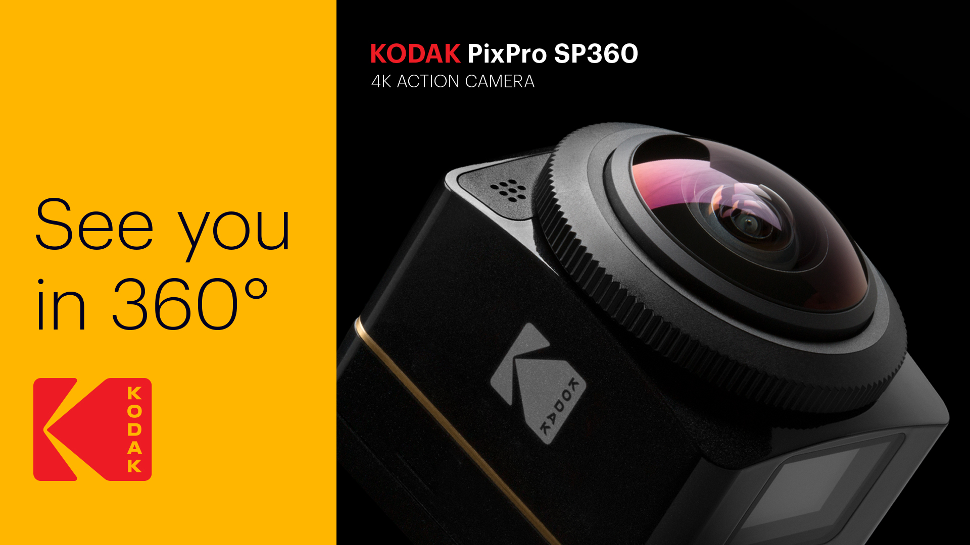
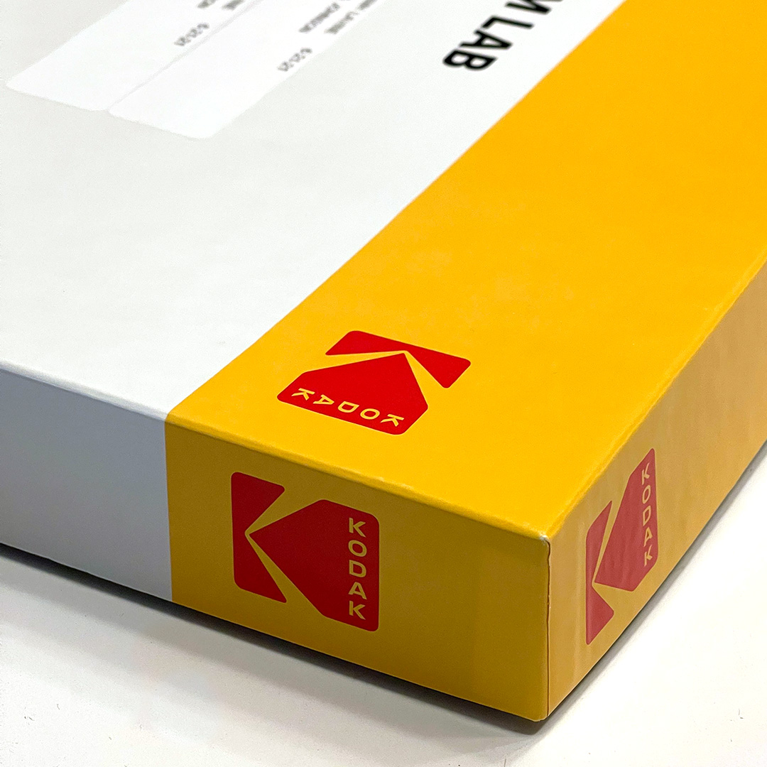
The optimistic power of yellow
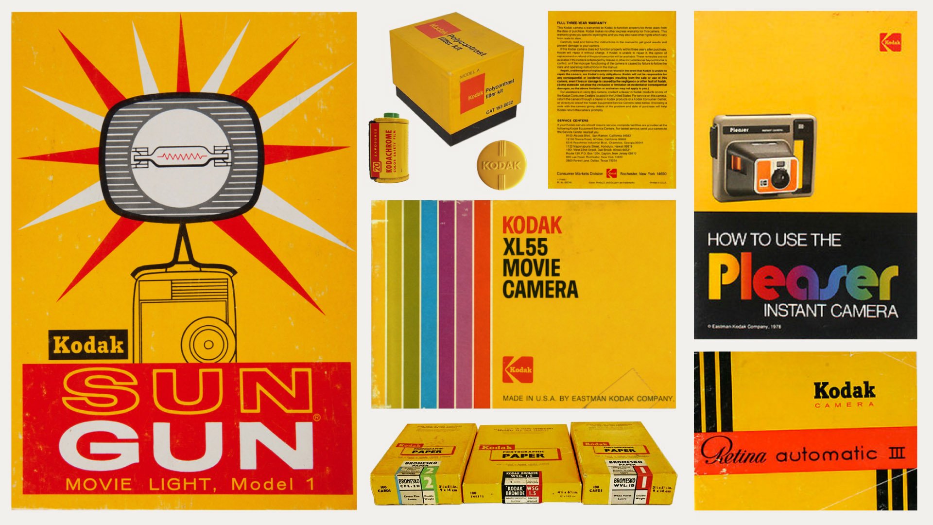
Drawing on the heritage of Kodak’s trade dress Yellow was our first and most crucial step. Looking back at archival packaging, it is the most cohesive and memorable piece of the brand.
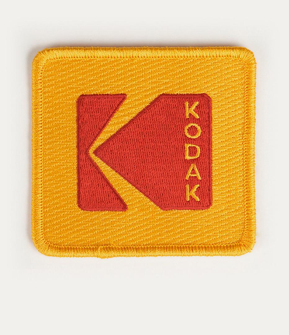
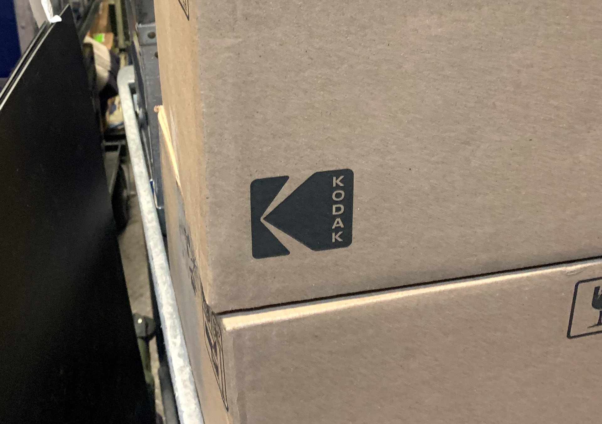
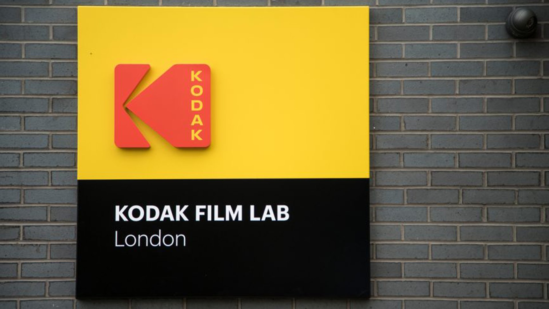
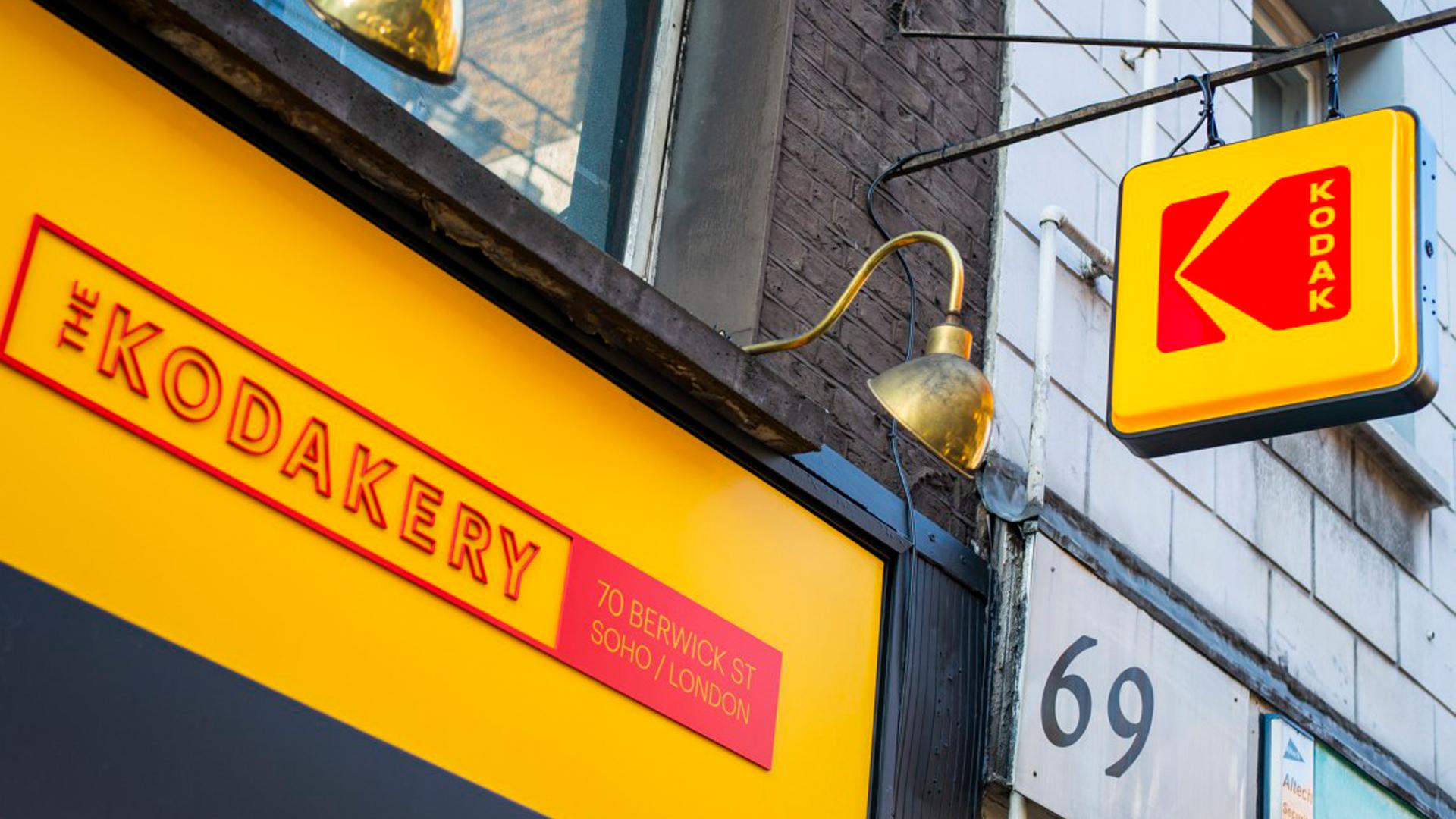
An enduring icon
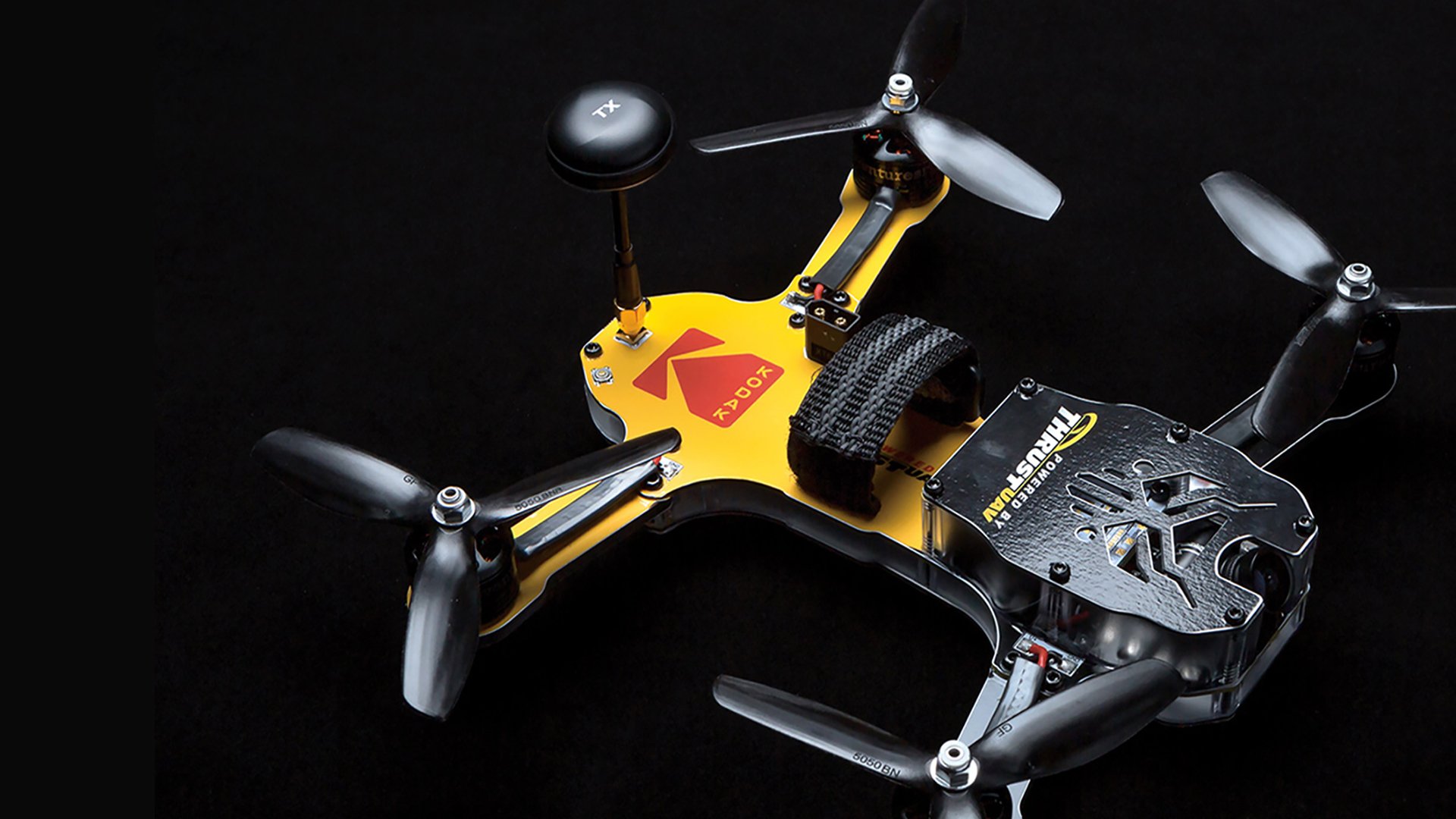
Next was to bring back the “K” icon, one of the most recognized logos in the world.
Abandoned by the company only a decade earlier, the logo was still present in the consumer’s mind’s eye, thanks to millions of signs in shop windows around the world. Over the next 6 to 8 months, the Kodak icon would begin to appear in brand materials as a hint of things to come.
Finally, we retooled the Kodak wordmark with the icon. Our goal was to make it feel both modern and timeless, and to create a more natural integration with the symbol.
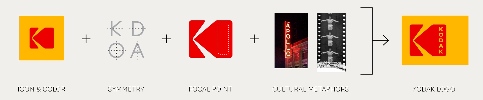
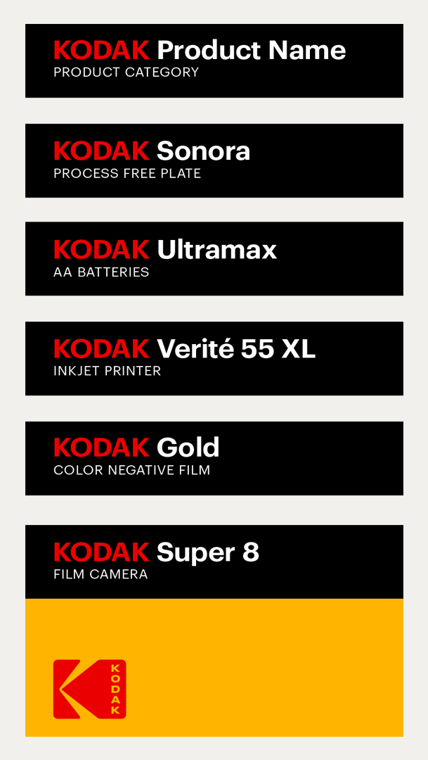
Bringing cohesion to the brand
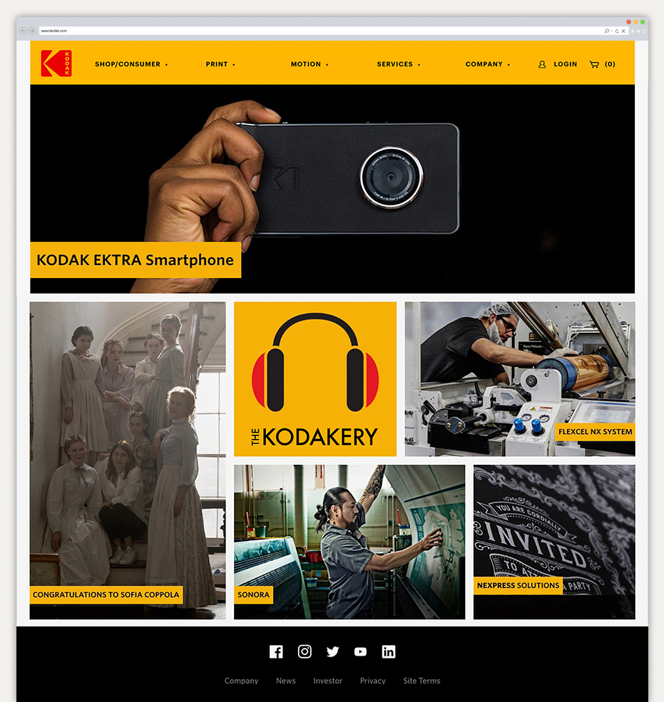
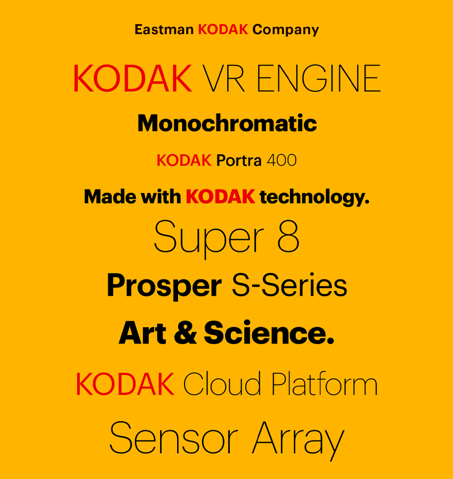
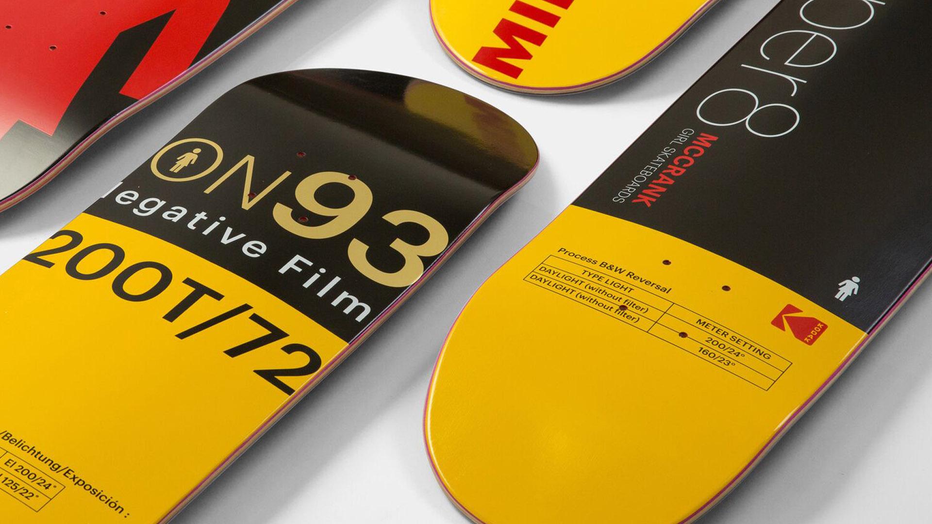
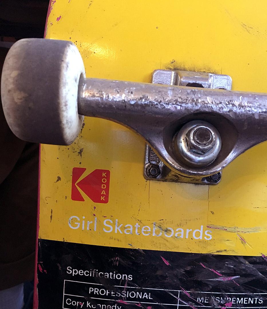
From the brand architecture to positioning principles for licensees to packaging guidelines, Work-Order unified all materials to produce a comprehensive visual system inspired by Kodak’s rich history and poised for the future.

We have a brand people love. And that’s where we are putting our focus.
— DANY ATKINS, KODAK, CHIEF BRAND OFFICER
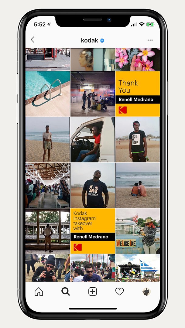
Socializing legacy brand language and usage

© 2021 WORK-ORDER
© 2019 WORK-ORDER