
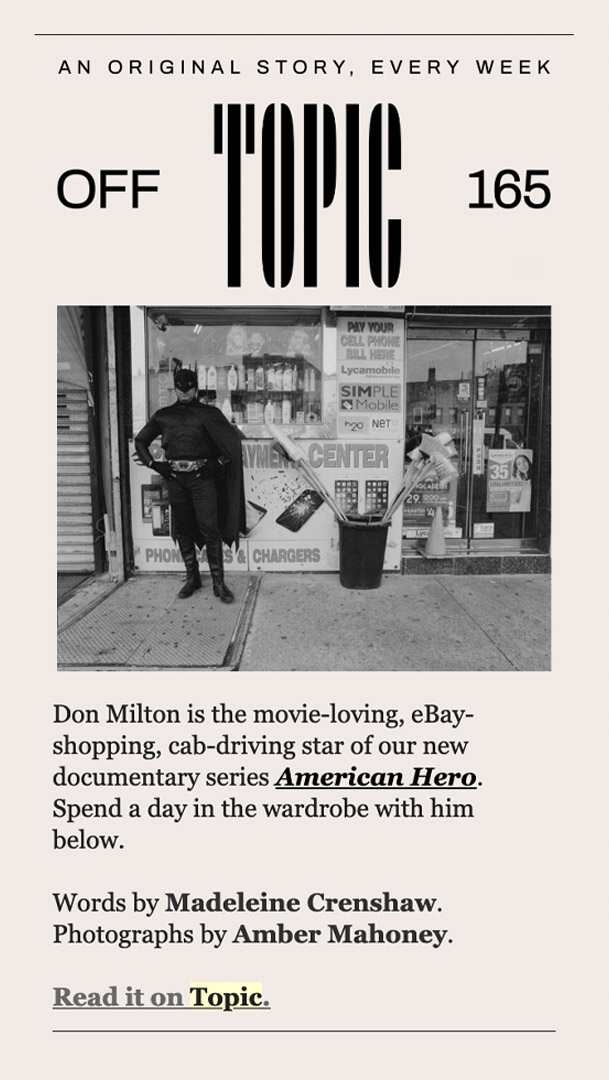
With First Look Media’s award-winning Field of Vision and The Intercept already underway, the company aimed to create a third omnibus brand. The brief was amorphous: Convey the brand’s role as part-publisher and part-distributor, feature content creation of any kind, length and format and be entirely platform agnostic.
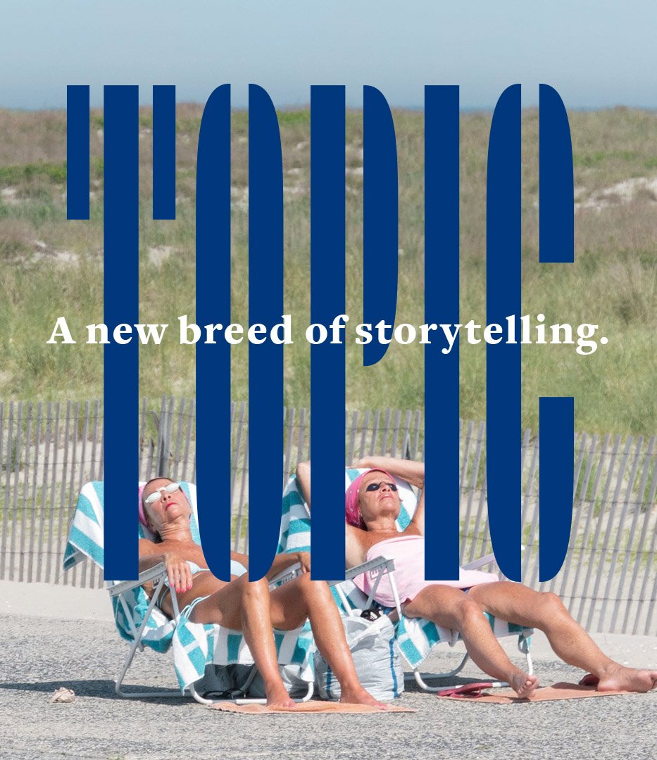
In other words, it needed to be flexible, elemental and evergreen, right down to its name. Our solution was to pair a straightforward, genre-neutral name with a more expressive wordmark. The combination imbues Topic with personality, yet is still flexible enough to let the voice of the content lead the brand.
NAMING
LOGO
BRAND SYSTEM
CAMPAIGN
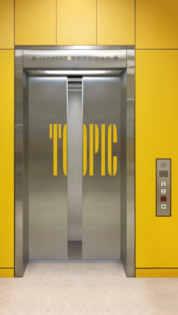
Standing tall
1200 names were considered, 60 presented and 30 legally vetted, before one short URL was registered: Topic.com.
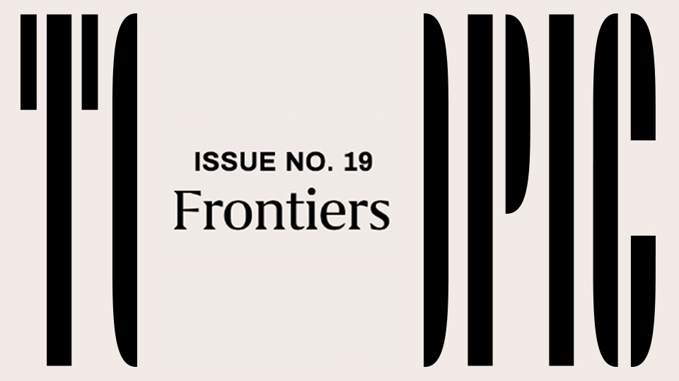
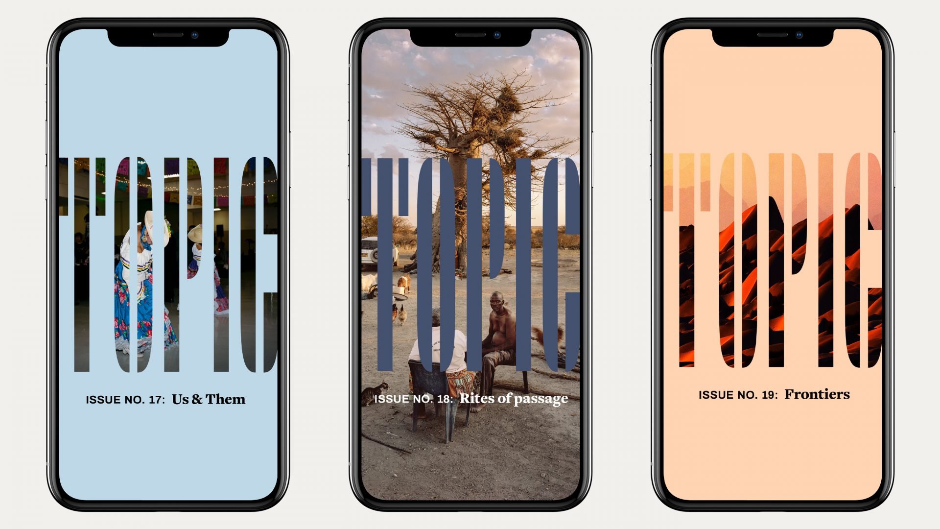
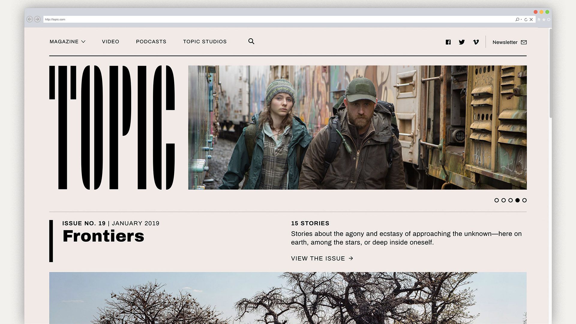
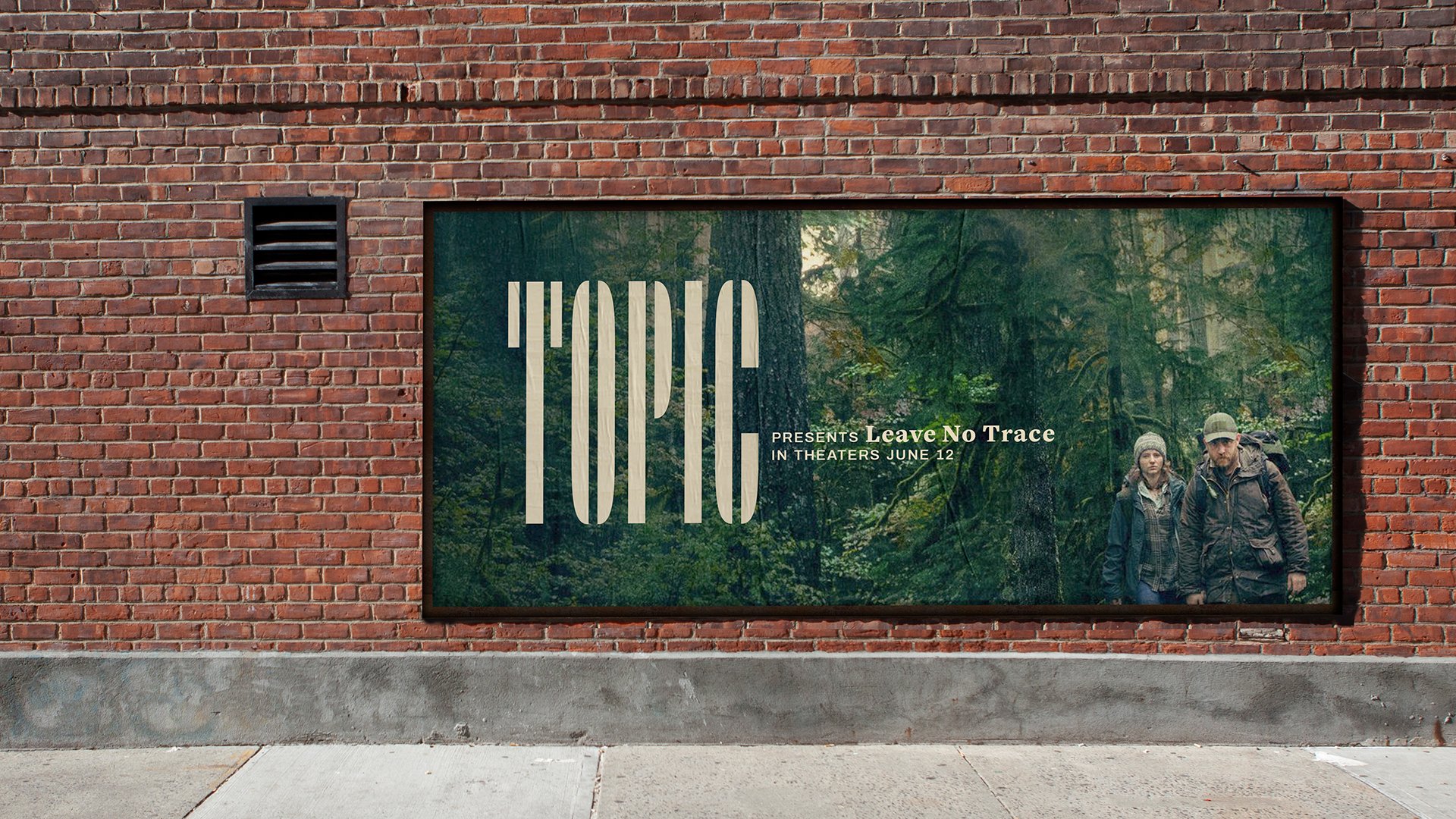
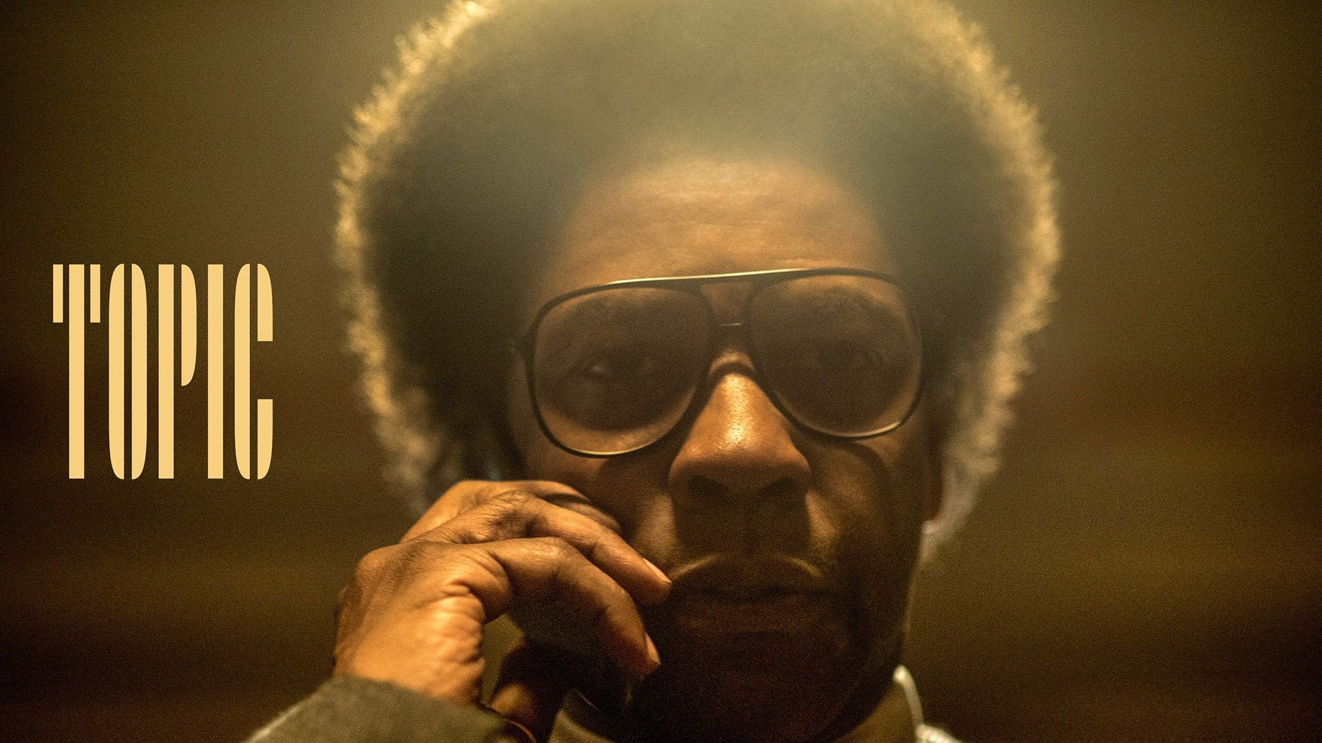
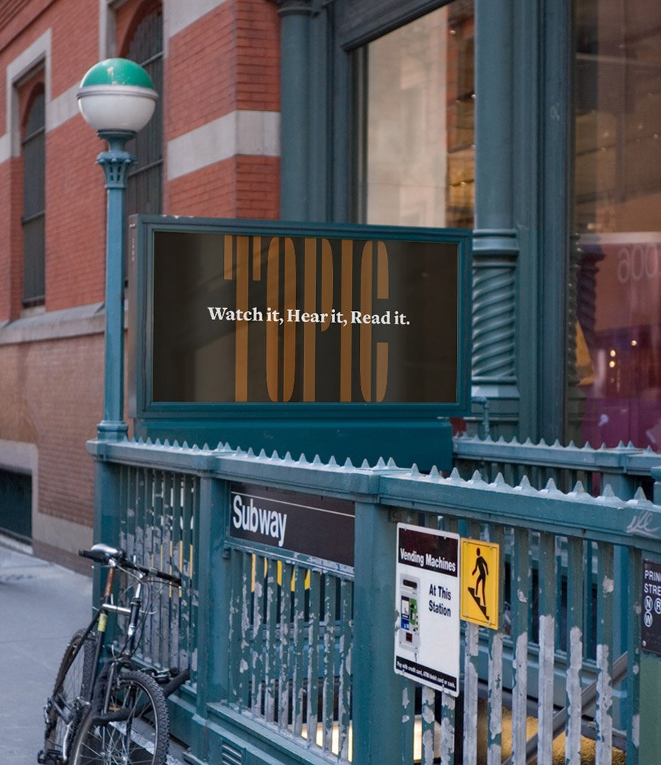
The Topic logo stands confidently tall while abstractly hiding in plain sight. Its elongated stencil letterforms let the content shine through, and its pieces imply an assembled collection. And for small applications, such as app icons, the forms are visually shorthanded, reading more as a quick-to-identify symbol than as the word itself, without the creation of an additional form.
© 2021 WORK-ORDER
© 2019 WORK-ORDER